Color
Color Components
Color is made up of hue, saturation, and brightness. Hue is the actual color—red, blue, or yellow, for example. Saturation is the intensity or purity of the color pigment. And brightness is the the amount of white or black mixed into the color.
Color Systems
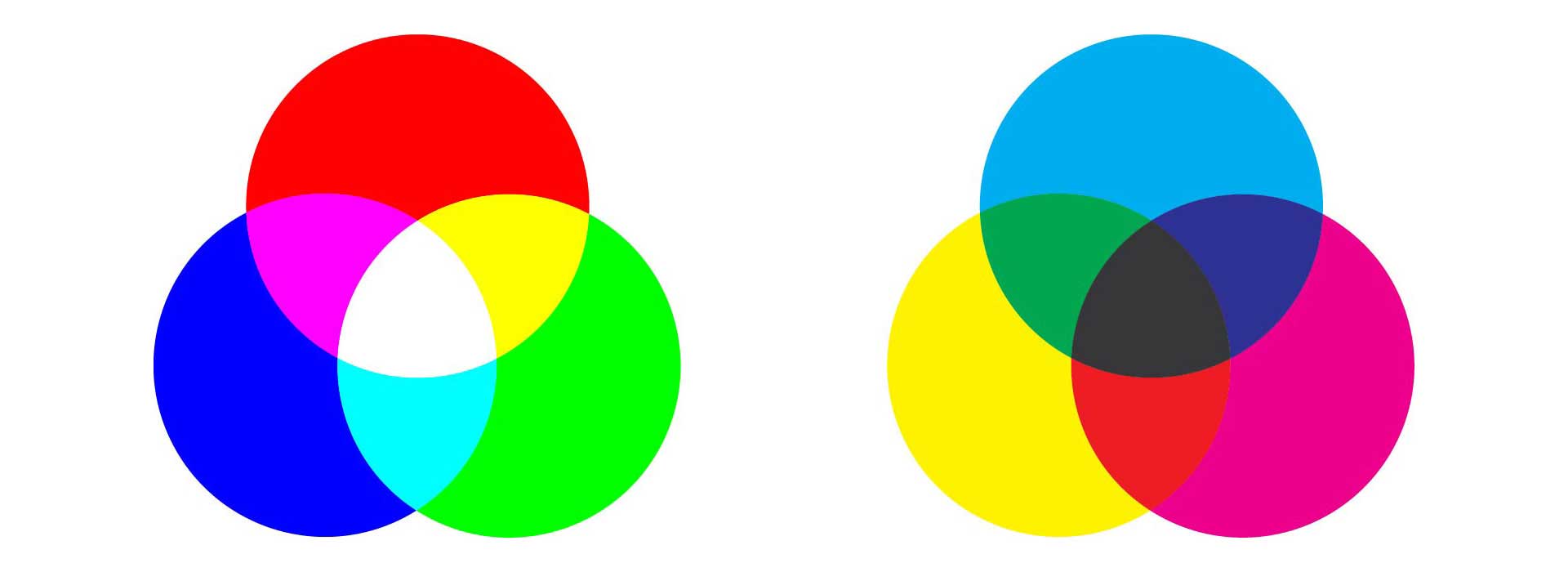
In digital media we use two color systems: additive and subtractive. Additive color systems are created from colored lights. Computer, television, and smartphone screens all use additive colors systems. The basic colors of an additive system are red, green, and blue (RGB); mix them all together and you have white. The subtractive system is made of colored pigments. Painters and ink printers use subtractive color systems. For printers the basic pigments are cyan, magenta, yellow, and black or key (CMYK); mix cyan, magenta, and yellow together and you have black.
Color Wheel
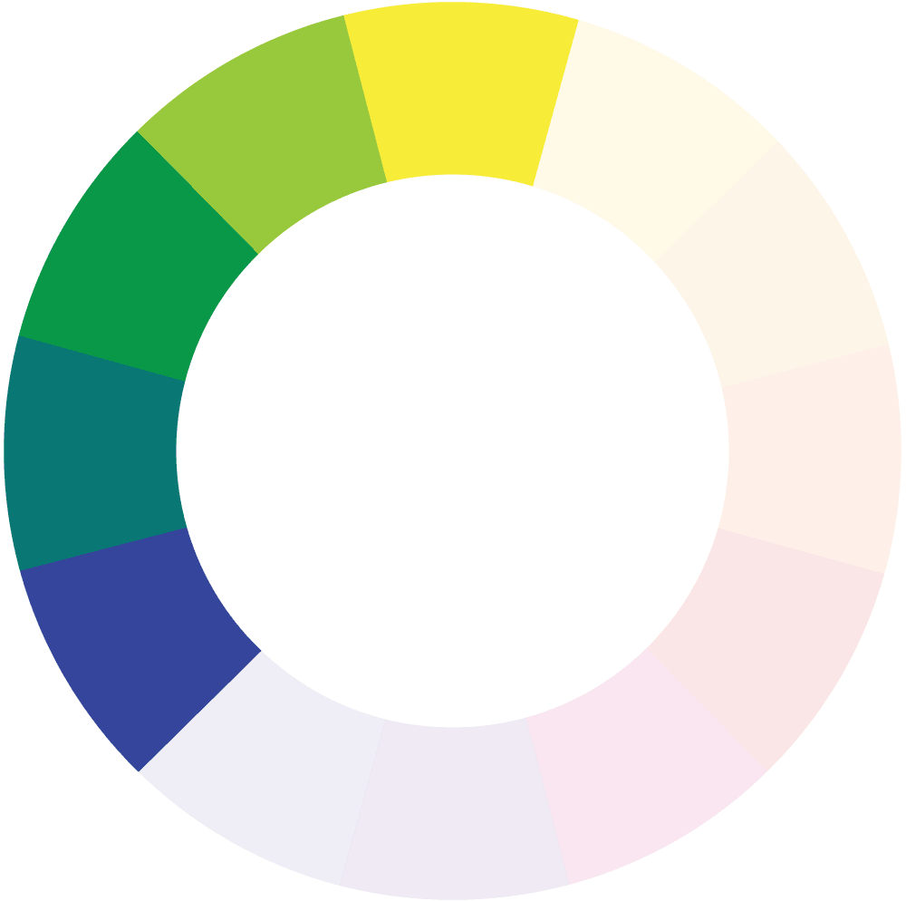
The color wheel is one way to organize a simple array of colors; it situates the primary colors equidistant from each other on the wheel. The primary colors—red, yellow, and blue—are the most basic colors, the ones that cannot be created by mixing other colors. Directly opposite the primaries on the color wheel are the secondary colors: green, purple and orange, colors created by mixing two primaries. Tertiary colors make up the remaining color segments on the wheel. These colors are created by mixing a secondary color with its adjacent primary.

Color's Psychological Effects
Colors communicate sensations—they can be warm or cool, dark or light, and intense or dull. The color of a room, a landscape, or a product can draw us in or repel us. These psychological effects are often subjective and culturally determined.
Many artists categorize colors by their temperature. Cool colors tend be on the blue-green side of the color wheel; warm colors on the orange-red side of the wheel.
Color Context
The temperature of a color is often relative to its surrounding colors. If we're looking at two cool colors, for example, one may feel warmer than the other if it's closer to the warm side the color wheel. Look at the greens on the color wheel. Most greens are fairly cool, but the green next to yellow is quite warm while the green next to blue is quite chilly. In general when comparing colors that are close in hue, the colors closer to the warm side of the color wheel feel warmer and the colors closer to the cool side of the wheel feel cooler.
A color's saturation also affects its temperature. Very intense warm colors feel hotter than dull warm colors; intense cool colors feel colder than dull cool colors. Painters mute a color by adding a little of its complementary color to it. If you want to cool down an orange, you add a little blue.
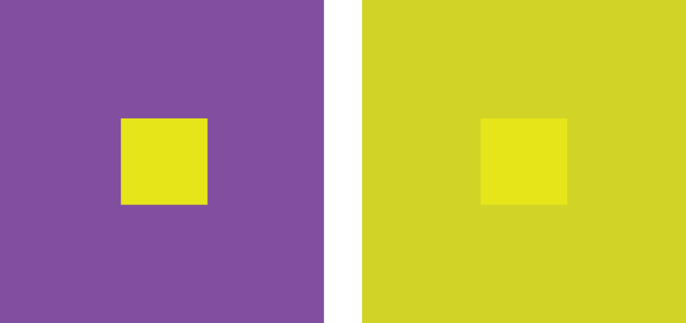
The surrounding environment of a color also influences the way it's perceived. Look at the small yellow squares in the middle of the larger squares below. Both squares are the exact same yellow color. They look like different versions of yellow because the background affects the way we read the color. The complementary purple pushes the yellow on the left forward. The mostly yellow background on the right, reduces the intensity of the yellow square on the right.
Color's Cultural Associations
Cultures assign characteristics to color. In the US, many see red as aggressive, blue as calm, and yellow as quirky. We see primary colors as playful and use that basic palette for children's toys.
Cultural associations are often arbitrary. David McCandless created this info graphic to illustrate the different interpretations of color around the globe.
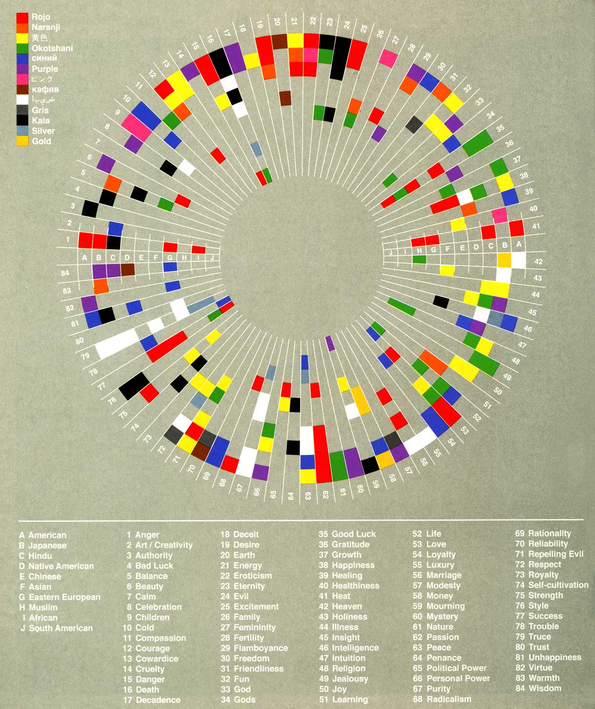
David McCandless, Colours and Culture, The Visual Miscellaneum
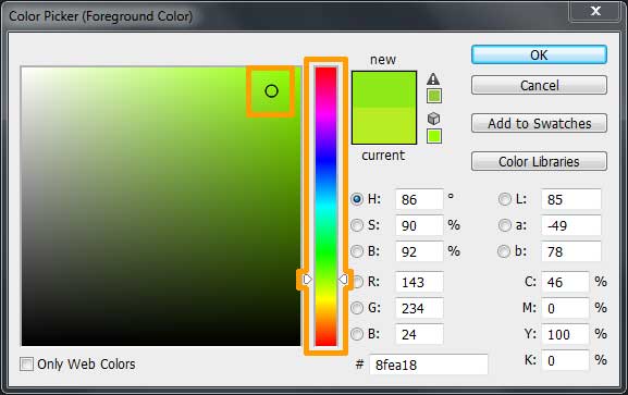
Creating Digital Colors
In the digital world, we select colors with our graphical editor's color picker. In Photoshop, double click on your Tool Panel's color box to open the Color Picker panel. Slide the triangles on either side of the color slider in the middle of the panel to change the hue. Warm up a color by sliding towards yellow and orange hues; cool down a color by sliding towards green and blue hues. Alter the saturation and brightness of a color by moving the circle icon inside the color field located on the left side of the panel. Move the circle horizontally to change saturation—the most intense colors are on the right hand side. Move the circle vertically to change the brightness—add more white by moving up, add more black by moving down.
Continue to Create a Palette.